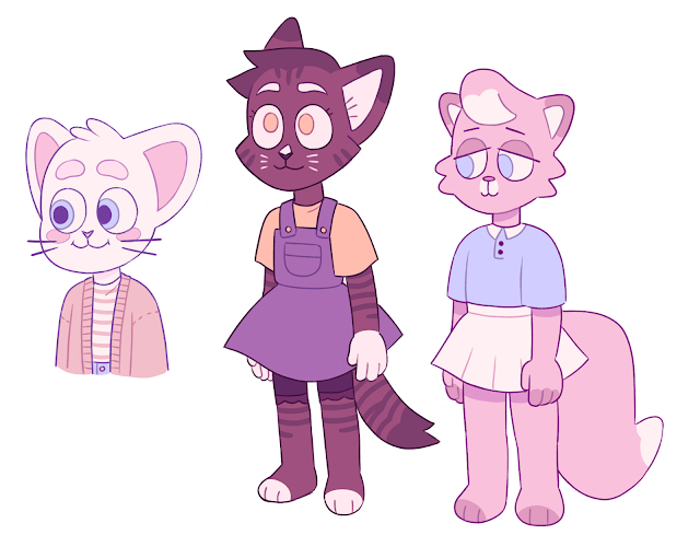
While working on the design for the school, playground, classroom, and some of the props, I revisited my concept art and polished it up a little bit as I wasn't satisfied with the colours I'd been using nor was I happy with how some of the sketches looked and the way that I'd laid them out.
Tuesday, 31 March 2020
Careers: Logo Redesign, Business Cards, and Grid Practice
These are the five posters I made using the grid we were given for our careers class.
I went in and redesigned my logo after some feedback - I was initally only going to replace the 'BA (Hons) Computer Animation Arts' caption with 'Character designer', but I decided to redraw my entire logo instead so it looked more clean and updated on my blog. I made multiple different versions of it; first of all, the logo that I started off with, then a version with a second font. There is also a blank version, a version of the first logo that has been sized down to fit on my blog, and then a cropped version without any text.
I also filled out the personal brand guide sheet with the fonts, colour palette, and tone of voice that I am aiming for. I then made a mock-up of a business card.
Thursday, 19 March 2020
Premise: Character Design (Part 5)
I proceeded from the previous designs onto the other characters and started to explore how these characters could essentially fit into the school setting. I started looking at the fantasy creatures first with another centaur design, another mermaid design, a medusa-based design, and a minotaur coach/teacher.
At this point, I realised that I was overall enjoying creating the animal designs more than the fantasy ones, and it felt like the animal characters had a more obvious overarching theme that tied all of the designs together for a more cohesive look. I also considered something that I had spoken to Alan about previously as well, which was that having multiple characters that were vastly different in design would be difficult to keep up with in terms of rigging and modelling, and that perhaps more generic blank slates could be modelled/rigged and then textured to make them look different instead. This could then mean that I could start to look at characters with animated textures on their faces instead of making entirely new models for each individual character.
I moved on to the animal designs again, looking at some of the previous designs I'd made and working on them somewhat.
At this point, I started to look at horse-like characters and faces for cats. I also went back to the kangaroo design that I'd made for the first iteration of the idea and used it to make her into a 'teacher' character.
For both the animal and fantasy designs, I considered what Justin had said about there being some kind of antagonist character or characters, such as a group of bullies. While I did try to explore this briefly in some of the designs, I don't think having a narrative of an antagonist versus a protagonist would really fit into what I was trying to write about, so I am intending on focusing on friendlier and cuter designs.
In terms of the other character that will become friends with the main character, I am leaning more towards the yellow dog and the brown cat designs at the moment.
Premise: Character Design (Part 4)
After some consideration, I decided that it would probably be better if I explored the school idea that I spoke about with Justin. This would allow me to focus on the original experience that the story is based off of in more detail. As such, the character would not be moving towns, but instead moving school. This allows me to set the story in a single place - the school - instead of worrying about designing the whole town, different building interiors, and a huge array of characters. Instead, I can give more attention to the school and its interior design overall.
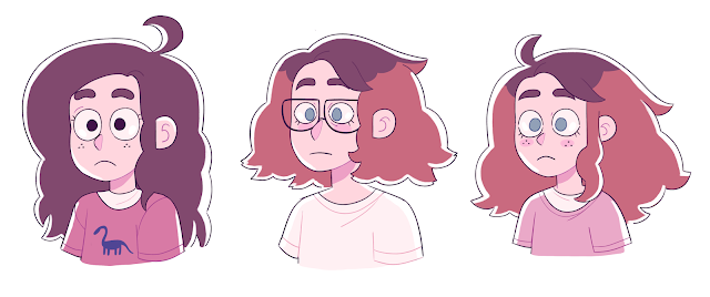
The issue that I then encountered was that I liked both the older design and the younger design that I had made. To begin to try to solve this, I looked at blending the two together to create a third new design. I'm not quite finished with it yet, but I am happy with the results of directly combining both. My next step with the main character is to design an outfit that clashes less with their hair colour, though I do want to keep it similar to the younger design's initial outfit.
Premise: Character Design (Part 3)
I proceeded by continuing with the initial older design first and drawing out some designs based upon the idea that the character would be moving house into a new town/city filled with people that were not like them, displayed in the visual style again of either having everyone else look like animal people or like fantasy creatures.
When thinking about the types of people in a town, there were were quite a few that stuck out to me, including shopkeeper/employers, parents and their children, elderly people, and the like.
I experimented with different species. I found that if I were to choose to go ahead with the animal characters, I would probably keep a mix between colour schemes based off of the actual animal species and less natural and rather bright colour schemes and patterns to make them stand out from each other a little more.
I also continued to look at the fantasy creatures (particularly demons and cyclops-type characters), but I found I was beginning to favour the animal characters more as they had a friendlier and slightly more appealing look to them.
Premise: Character Design (Part 2)
I've been working on the piece of writing that will hopefully end up accompanying the project while working on sketches for the characters at the same time and gradually working on polishing them up to a standard that I am happy with.
I have been working on outfit designs and how the character's face and hair looks and playing around with different ideas since they're based off of me quite heavily at the moment. While I do enjoy the older designs for the character, I have been thinking of lowering the age and working with one of the other initial designs so that the narrative takes place within a school environment as I feel it is more appropriate to work with given that the experience I am currently basing the story on took place when I was a lot younger. There is also a possibility of blending the designs together somewhat which I have also been experimenting with.
Wednesday, 18 March 2020
Toolkit 2: Drawing: Session 15
During this week's life drawing lesson, I decided to focus on details such as the face and hands of the model as I feel I need to improve on these the most. We started off with less time to begin with, and then spent longer on the drawings as the session went on.
Subscribe to:
Comments (Atom)
-
Fig. 1: Theatrical release poster for Coco (2017). This review will be investigating Christopher Vogler’s and Carl Jung’s archetype...
-
My thumbnails for Armilla allowed me to explore the ways in which water is central to the city's infrastructure. Given the informati...


