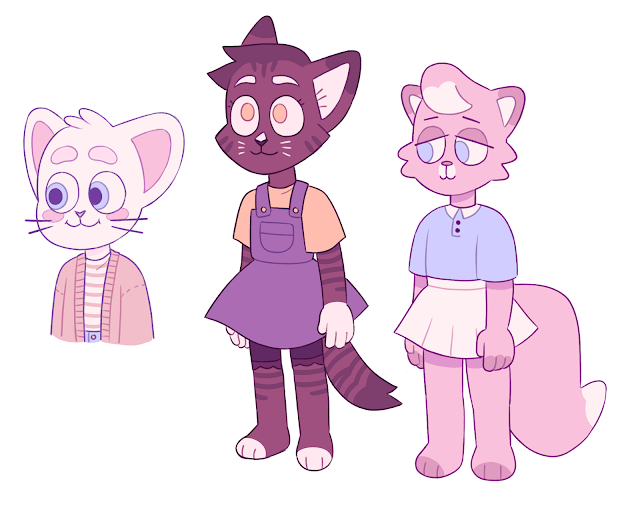
While working on the design for the school, playground, classroom, and some of the props, I revisited my concept art and polished it up a little bit as I wasn't satisfied with the colours I'd been using nor was I happy with how some of the sketches looked and the way that I'd laid them out.
Subscribe to:
Post Comments (Atom)
-
Fig. 1: Edward Scissorhands Poster (1990) This review will focus on Tim Burton's Edward Scissorhands (1990) and how the concept...
-
Fig. 1: Theatrical release poster for Coco (2017). This review will be investigating Christopher Vogler’s and Carl Jung’s archetype...
-
My thumbnails for Armilla allowed me to explore the ways in which water is central to the city's infrastructure. Given the informati...
No comments:
Post a Comment