Saturday, 28 November 2020

Toolkit 3: Photogrammetry: Render Passes (Part 5)

This tutorial had us using render passes which were then exported into Adobe After Effects and composited together.

Starting off by duplicating one of the spheres and placing it on top of the container.

Opening the different editors to work in.


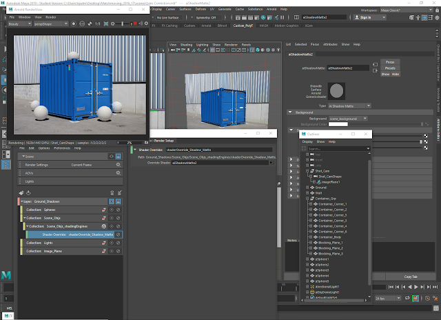
Creating a 'ground shadows' layer with multiple collections inside which have the corresponding shapes in the scene added to each of them.


Adding a shader override to a shadow matte shader beneath the scene objects layer and reloading the renderview.


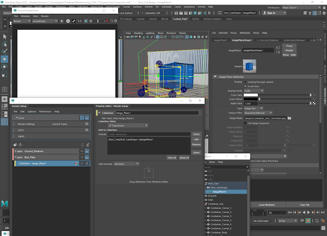
Setting up the image plane collection using an absolute override on the display mode attribute of the image plane shape.


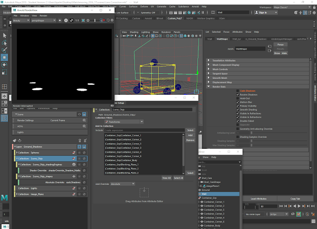
Setting up the spheres collection by creating an absolute override on the primary visibility attribute on the render stats of each sphere in the scene.

Placing an absolute override on the casts shadows attribute on the scene objects collection.


Creating a back plate layer and an image plane collection within it.


Creating a sphere matte layer with spheres, scene objects, lights, and image plane collections. The former two collections have shader overrides attached to them while the latter two have absolute overrides attached to them.


Creating a beauty pass layer and adding everything to it underneath a single collection.


Adjusting the render settings and then the render sequence settings.


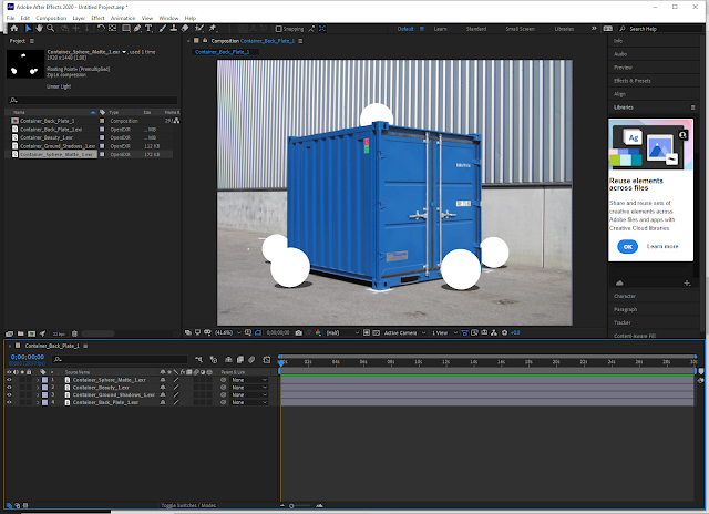
Rendering out each of the layers as individual passes in .exr format, opening Adobe After Effects and importing them, and then changing the settings from 8 bits per channel to 32.


Setting the alpha channels on the beauty and back plate passes to be ignored.


Dragging each of the files onto the composition and layering them accordingly.


Attaching the beauty pass to the sphere matte pass, changing the opacity of the ground shadows pass, and applying a gaussian blur to it.


Adding a grain effect to the beauty layer to better integrate the added objects into the scene.

Toolkit 3: Photogrammetry: Non-Compositing Integration of Objects (Part 4)

 The next tutorial looked at how to integrate objects into the scene and render it out.

Adding extra planes to the back of the container.

Adding spheres to the scene by creating one on its own and snapping its pivot to the ground plane, scaling it down, and duplicating it and then moving them around the scene before making any further adjustments.


Adding surface shaders to the spheres.


Placing a directional light into the scene and configuring its rotation to match the image.


Rendering out the results so far in the Arnold Renderview.


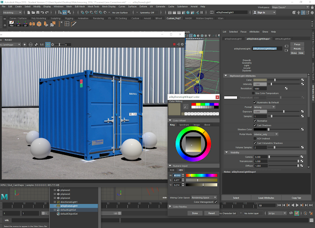
Creating a skydome light.

Editing the skydome light by changing its attributes including colour to better reflect to conditions in the image.


Changing the opacity of the shadows in the shadow matte shader.

Toolkit 3: Photogrammetry: Scene Modelling (Part 3)

 The next tutorial had us modelling the scene in more detail to better match up with the image.

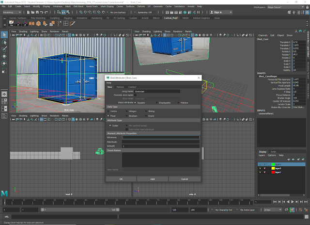
Starting out by creating attributes for the camera.

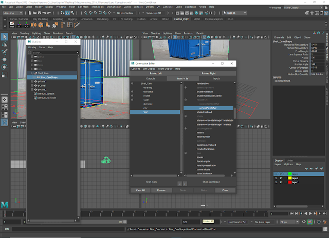
Using the connection editor to link up the three newly created attributes to the overscan, horizontal film offset, and vertical film offset inputs respectively.


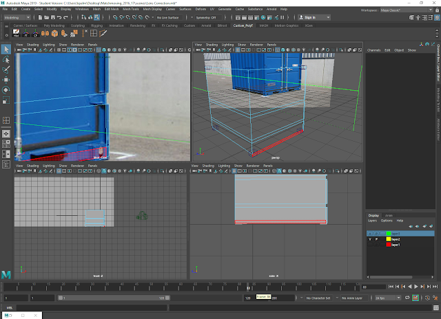
Removing unnecessary faces from the container and making further adjustments.


Adjusting the background wall plane before extruding it to fit the image.


Creating smaller cubes to fit with the blocks on the top and bottom of the container and adjusting them depending on how well they fit with the image.


Adding further detail by putting in edge loops to corner off faces that could be deleted to form the notches in the container.


Renaming shapes and layers and tidying up the scene.


Toolkit 3: Photogrammetry: Camera and Scene Matching in 3D (Part 2)

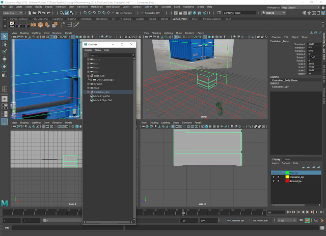
The next part of the tutorial involved importing the second image that we'd made adjustments to into Maya and creating the camera and basic elements of the scene before proceeding further.

Creating a camera and using it to import the image plane with the photograph on it.

Renaming the camera, and then creating a plane applied to a coloured layer to act as a grid.


Setting up a cube that will be used in place of the container in the photograph using a similar method to the plane: snapping the pivot point to the corner and then applying it to a coloured layer for better visibility within the scene.


Creating a plane that will be used as the wall behind the container in the photograph again using the same method as with the above objects.


Changing the focal length of the camera before increasing the scale and adjusting the rotation of the cube, and then beginning to change the position of the camera so the cube better matches the image.


Making further adjustments to the cube, background plane, and camera position.


Bookmarking the camera.


Simplifying the grid and locking the camera's attributes.


Toolkit 3: Photogrammetry: Lens Correction (Part 1)

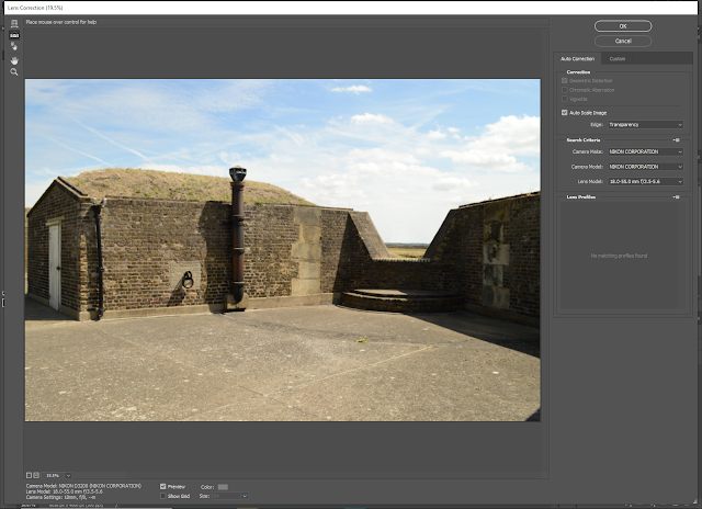
The next set of Photogrammetry tutorials began with looking at lens correction and how to do it in Photoshop using two photographs supplied to us. The first of these had file data attached to it, whereas the second did not, thus giving us two separate (but very similar) methods to work with.

Opening the photographs in Photoshop.


Looking at the file data on the first photograph.


Using the lens correction filter to straighten the photograph and remove any distortion around the edges; as this photograph has file data attached to it regarding the camera that was used to take it, this information was able to be used to fix any distortion automatically.


Moving on to the second picture which doesn't have file data attached to it and opening it in the lens correction filter, then turning on the grid and lining it up with one of the edges on the container.


Using the straighten tool.


Toolkit 3: Cameras and Perspective (Tilt Shifting)

 This part of the 'Photogrammetry' tutorials had us looking at how to create the tilt shift effect in Photoshop using images that we selected from a variety that we were given.


Friday, 27 November 2020

Minor: Environment Designs (Coloured)

 When it came to colouring in my environments, I had to consider different versions of them alongside what I would consider the 'original' with fully saturated colours. I decided that instead of only using greys and relying on desaturation alone, I would work in different overlays that gave blue tones and darkened the scene at the same time to better convey the feeling of loneliness and sadness that Kit feels as the film progresses.

School exterior


Corridor (2 angles)


Playground


Classroom (2 angles)