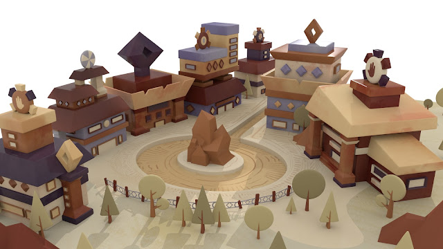
This morning, I made some adjustments to my textures. To begin with, I went in and updated the ground texture so the patterns are more defined and visible in the render, and I made some of the trees & their trunks darker to add a little bit of variation. For the rest of the textures, I made some changes to the specularity so they are shinier and have a glossier effect like Sherman's work.


Looking strong, Karris.
ReplyDeleteThank you :)
Delete